[Python / Study] plotly 사용하여 시각화 연습 (3)

1. 라이브러리 설치 및 데이터 불러오기
- 코드
import pandas as pd
print(pd.__version__)
sales = pd.read_csv(DATA_PATH + 'raw_sales.csv', parse_dates = ['datesold'])
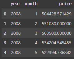
sales.head()pandas 라이브러리를 설치하고 버전을 확인합니다.
pandas 버전은 1.5.3 입니다.
raw_sales.csv 파일을 불러와서 sales 변수에 저장합니다.
datesold 열은 데이터를 날짜 형식으로 파싱하였습니다.
- 출력

데이터를 불러와서 5개 열만 출력했습니다.
2. 데이터 전처리
- 코드
sales['year'] = sales['datesold'].dt.year # 연도 열 생성
sales['month'] = sales['datesold'].dt.month # 달 열 생성
먼저 datesold 열을 dt.year를 사용하여 year 열과 month 열을 새로 생성했습니다.
- 코드
result = sales[sales['year'].isin([2008, 2018])] # 2008년 2018년 자료만
result = result.groupby(['year', 'month'])['price'].agg('mean') # 연도와 달을 가격 평균으로 저장
result = pd.DataFrame(result).reset_index()
result.head()
result 변수에 연도를 2008년과 2018년 자료만 가져와서 저장했습니다.
그리고 연도와 달을 그룹화하여 가격 평균을 가져왔습니다.
그리고 데이터 프레임으로 만든 후 인덱스를 새로 지정하여 result 변수에 저장했습니다.
- 출력
상위 5개 열만 출력한 내용입니다.
연도와 달을 기준으로 가격 평균이 나와있습니다.
3. 시각화
- 코드
import plotly.express as px
fig = px.line(result, x = 'month', y = 'price', color = 'year', markers = True)

fig.update_layout(title_text = "Title")

fig.update_layout(
                 title_x = 0.5, # title x축 위치
                 title_y = 0.95, # title y축 위치
                 title_xanchor = "center", # 중앙
                 title_yanchor = "middle") # 가운데

fig.update_layout(title_font_size = 25, # 제목 글자 크기
                  title_font_color = "red", # 제목 글자 색
                  title_font_family = "Times")
fig.show()
px.line 선 차트를 그렸습니다.
x 축은 month, y축은 price, color는 연도를 기준으로, markers 는 True로 해서 마커를 표시했습니다.
그리고 밑에 코드들은 제목에 대해 설정하는 코드입니다.
- 시각화
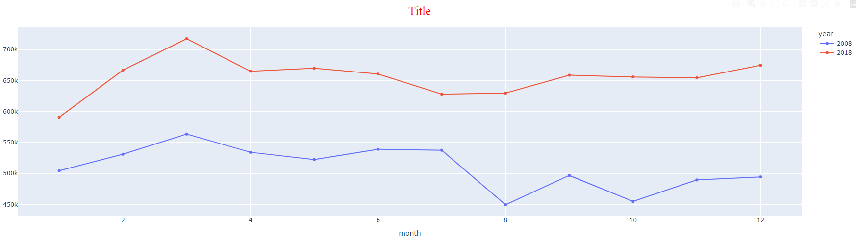
시각화 한 모습입니다.
4. 막대그래프 시각화
- 코드
import plotly.graph_objects as go
from plotly.subplots import make_subplots
import plotly.io as pio

pio.templates.default = "plotly_white"

fig = make_subplots(rows = 2,
                    cols = 1,
                    subplot_titles = ("1 Chart", "2 Chart"))

for i, year in enumerate([2008, 2018]):
  data = result[result['year'] == year]
  fig.add_trace(go.Bar(x = data['month'],
                       y = data['price'],
                       name = str(year)),
                row = i + 1,
                col = 1)
fig.show()
다음은 막대그래프를 시각화 해보겠습니다.
plotly_white 템플릿을 가져왔습니다.
그 다음 2개의 행과 1개의 열로 구성된 subplot을 만들었습니다.
그리고 반복문을 사용하여 차트를 그렸습니다.
- 시각화

시각화 한 모습입니다.
5. boxplot 시각화
- 코드
result = sales[sales['year'].isin([2007, 2008, 2009, 2010])]
result = result[result['price'] <= 2000000]
fig = px.box(result, x = 'year', y = 'price', color = 'propertyType')
fig.show()
연도를 2007년부터 2010년까지 가져와서 result에 저장했습니다.
그리고 조건을 넣어서 200만 이하의 가격만 나오도록 저장했습니다.
- 시각화
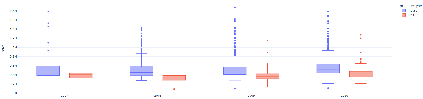
boxplot으로 시각화 한 모습입니다.
지금까지 plotly를 이용하여 시각화를 해봤습니다.
제가 공부하는 과정을 기록하는 글입니다.