[Python / Study] 데이터 전처리 연습하기

1. 라이브러리 설치 및 데이터 불러오기
from google.colab import drive
drive.mount('/content/drive')
드라이브를 마운트합니다.
import pandas as pd
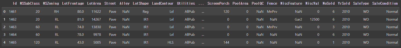
train = pd.read_csv(DATA_PATH + "train.csv")
train.head()pandas 라이브러리를 설치합니다.
DATA_PATH에 데이터 경로를 저장한 이후 train.csv 파일을 불러옵니다.

head()로 상위 5개 행만 불러왔습니다.
train.info() # 데이터 타입 / 컬럼명 확인 / 결측치 확인그리고 train 데이터의 타입과 컬럼명, 결측치를 확인합니다.

# test 데이터 불러오기
test = pd.read_csv(DATA_PATH + "test.csv")
test.head()
그 다음 test 데이터를 불러옵니다.
head() 함수로 상위 5개 행만 출력했습니다.
test.info()
데이터, 컬럼명, 결측치를 확인합니다.
2. 이상치 제거
train.shape행과 열을 출력합니다.
(!460, 81)이 나왔습니다.
train[(train['OverallQual'] < 4) & (train['SalePrice'] > 10000)]그 다음 OverallQual이 4 미만, SalePrice가 10000 이상인 자료만 출력합니다.
train = train.drop(train[(train['OverallQual'] < 4) & (train['SalePrice'] > 100000)].index, axis = 0)
train.shape
그리고 해당 행을 전부 제거합니다.
다중 조건을 넣어서 OverallQual이 4 미만, SalePrice가 100000 이상인 행의 인덱스를 뽑고 제거합니다.
train = train.reset_index(drop = True) # 인덱스 번호를 다시 메김.
train.shape
그리고 데이터의 인덱스 번호를 다시 메기고 행과 열을 출력했습니다.
(1455, 81)이 나왔습니다.
5개 행이 제거되었네요.
3. 수치 데이터 시각화 (연속형)
# Seaborn 시각화 그래프 : 히스토그램
import seaborn as sns
import matplotlib.pyplot as plt
from scipy.stats import norm # 통계 모듈
(mu, sigma) = norm.fit(train['SalePrice'])
print(mu, sigma)

fig, ax = plt.subplots(figsize = (10,6))
sns.histplot(train['SalePrice'], color = 'b', stat = 'probability') # probability : 확률
ax.axvline(mu, color = 'r', ls = '--')
ax.text(mu + 10000, 0.11, 'Mean Of SalePrice', color = 'r')
plt.show()
seaborn과 matplotlib.pyplot, norm을 설치합니다.
SalePrice의 평균을 구한 후 출력합니다.
그리고 위의 내용을 바탕으로 시각화하였습니다.
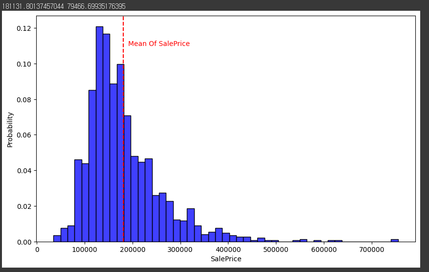
시각화를 한 모습입니다.
100000 - 200000 사이에 많이 분포하고 있습니다.
4. 로그 변환
# 로그 변환
import numpy as np
train['SalePrice'] = np.log1p(train['SalePrice'])
(mu, sigma) = norm.fit(train['SalePrice'])
print(mu, sigma)
np.log1p() 함수로 SalePrice를 다시 로그변환합니다.
그 이후에 시각화하는 과정은 똑같습니다.
fig, ax = plt.subplots(figsize = (10,6))
sns.histplot(train['SalePrice'], color = 'b', stat = 'probability') # probability : 확률
ax.axvline(mu, color = 'r', ls = '--')
ax.text(mu - 0.85, 0.105, 'Mean Of SalePrice <-------', color = 'r')
# ax.text(mu - 0.25, 0.105, '<-----', color = 'r')
plt.show()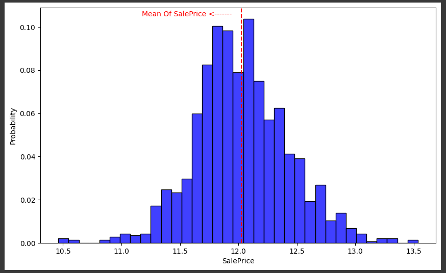
시각화 코드와, 시각화 한 모습입니다..
중앙으로 많이 정리가 된 모습입니다.
5. 불필요한 데이터 제거
train_ID = train['Id'] # train ID를 따로 저장 # 중복되는게 없어서 제거 # 패턴이 없어서 제거
test_ID = test['Id'] # test ID를 따로 저장 # 중복되는게 없어서 제거 # 패턴이 없어서 제거

train = train.drop(['Id'], axis = 1)
test = test.drop(['Id'], axis = 1)

train.shape, test.shape
train 데이터와 test 데이터의 ID 열을 제거합니다.
제거하는 이유는 패턴이 없기 때문입니다.
y = train['SalePrice'] # target 변수
y[:5]
그리고 y값 target 변수인 SalePrice도 따로 추출합니다.
train = train.drop('SalePrice', axis = 1)
train.shape, test.shape, y.shape
그 이후 SalePrice 행을 train 데이터에서 제거합니다.
((1455, 79), (1459, 79), (1455,))
행과 열은 이렇게 되네요.
6. 데이터 합치기
all_df = pd.concat([train, test]).reset_index(drop = True)
all_df.shape
원래는 따로 해야하지만 공부한다고 생각하고 train 데이터와 test 데이터를 합칩니다.
7. 결측치 확인, 제거
def check_na(data, head_num = 6):
  isnull_na = (data.isnull().sum() / len(data)) * 100
  data_na = isnull_na.drop(isnull_na[isnull_na == 0].index).sort_values(ascending=False)
  missing_data = pd.DataFrame({'Missing Ratio' :data_na,
                               'Data Type': data.dtypes[data_na.index]})
  print("결측치 데이터 컬럼과 건수:\n", missing_data.head(head_num))

check_na(all_df, 20)
그 다음 결측치를 확인하는 함수를 만들어 결측치를 확인합니다.
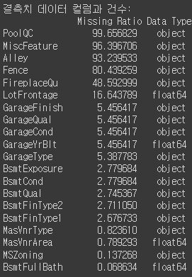
결측치에 대한 내용입니다.
all_df.drop(['PoolQC', 'MiscFeature', 'Alley', 'Fence', 'FireplaceQu', 'LotFrontage'], axis=1, inplace=True)
check_na(all_df)
너무 비율이 높은 열을 제거합니다.
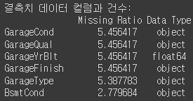
제거하고 다시 확인해보니 5.45가 제일 많습니다.
all_df['BsmtCond'].value_counts()그리고 이제 결측치를 채워보겠습니다.
BsmtCond 열의 값을 확인해봅니다.
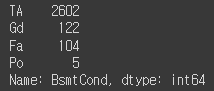
TA, Gd, Fa, Po가 있네요.
import numpy as np
# 문자열 컬럼만 추출
cat_all_vars = all_df.select_dtypes(exclude = [np.number])
cat_all_vars = list(cat_all_vars)

# 빈도수 추출 후, 결측치 추가
# fillna()
for i in cat_all_vars:
  all_df[i] = all_df[i].fillna(all_df[i].mode()[0])
숫자가 아닌 타입들을 결측치를 부여해줍니다. 가장 많이 있는 문자를 부여합니다.
# 평균, 중간값 / 중간값으로 한다.

# 문자열 컬럼만 추출
num_all_vars = all_df.select_dtypes(include = [np.number])
num_all_vars = list(num_all_vars)

# 빈도수 추출 후, 결측치 추가
# fillna()
for i in num_all_vars:
  all_df[i] = all_df[i].fillna(all_df[i].median())

check_na(all_df)
그 다음 문자열을 추출한 후 결측치 대신 중간값을 넣어줍니다.
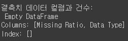
결측치를 제거했습니다.
7. 도출변수 / 파생변수
all_df['TotalSF'] = all_df['TotalBsmtSF'] + all_df['1stFlrSF'] + all_df['2ndFlrSF']
all_df = all_df.drop(['TotalBsmtSF', '1stFlrSF', '2ndFlrSF'], axis=1)

all_df['Total_Bathrooms'] = (all_df['FullBath'] + (0.5 * all_df['HalfBath']) + all_df['BsmtFullBath'] + (0.5 * all_df['BsmtHalfBath']))
all_df['Total_porch_sf'] = (all_df['OpenPorchSF'] + all_df['3SsnPorch'] + all_df['EnclosedPorch'] + all_df['ScreenPorch'])
all_df = all_df.drop(['FullBath', 'HalfBath', 'BsmtFullBath', 'BsmtHalfBath', 'OpenPorchSF', '3SsnPorch', 'EnclosedPorch', 'ScreenPorch'], axis=1)
print(all_df.shape)
비슷한 의미를 가지고 관계를 가진 데이터는 합쳐서 새로운 열로 만듭니다.
# year 도출 변수
year_features = ['YearBuilt', 'YearRemodAdd', 'GarageYrBlt', 'YrSold'] # 같은 방향성을 나타내고 있으니 모두 나타낼 필요가 없음

fig, ax = plt.subplots(3, 1, figsize = (10, 6), sharex = True, sharey = True)

for i, var in enumerate(year_features):
  if var != 'YrSold':
    ax[i].scatter(train[var], y, alpha = 0.3)
    ax[i].set_title(f"{var}", size = 15)
    ax[i].set_ylabel('SalePrice', size = 15, labelpad = 12.5)

plt.tight_layout()
plt.show()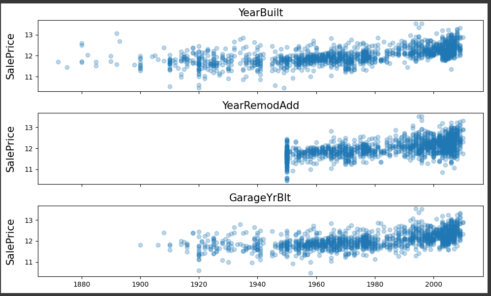
연도가 최근일수록 우상향하고 있음을 깨달았습니다.
all_df = all_df.drop(['YearBuilt', 'GarageYrBlt'], axis = 1)
all_df.shape
YearBuilt와 GarageYrBit을 제거해줍니다.
# YrsSold : 판매된 연도
# 리모델링 연도, 판매된 연도, 차이를 구할 수 있음
YearSinceRemodel = train['YrSold'].astype(int) - train['YearRemodAdd'].astype(int)
fig, ax = plt.subplots(figsize = (10, 6))
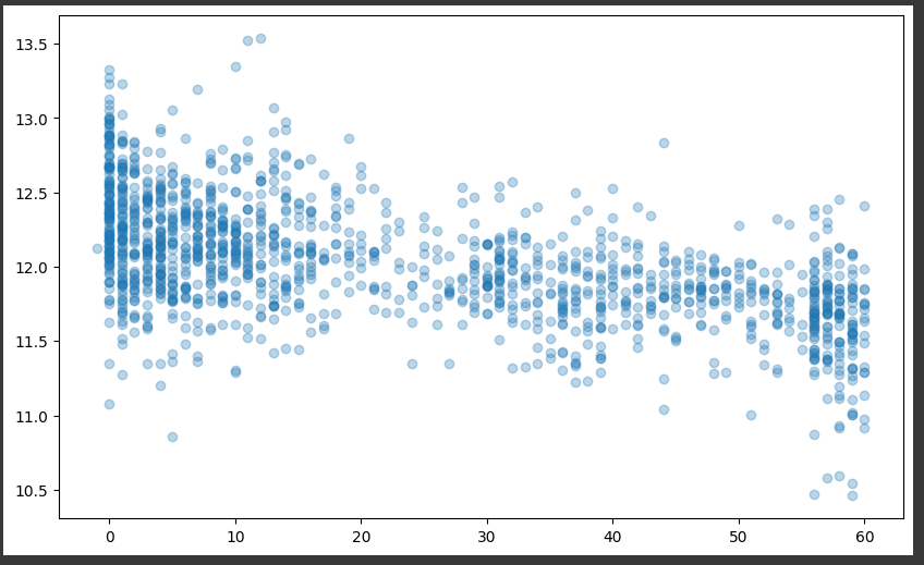
ax.scatter(YearSinceRemodel, y, alpha = 0.3)
plt.show()그리고 다시 YearSinceRemodel을 만든 후 시각화했습니다.
all_df['YearSinceRemodel'] = train['YrSold'].astype(int) - train['YearRemodAdd'].astype(int)
all_df = all_df.drop(['YrSold', 'YearRemodAdd'], axis = 1)
all_df.shape
그리고 열을 만든 후 제거해줍니다.
8. 더미변수
all_df['PoolArea'].value_counts() # no pattern
0이 압도적으로 많은 것을 알 수 있습니다.
원래는 제거해야하지만 더미변수로 만들겠습니다.
def count_dummy(x):
  if x > 0 :
    return 1
  else:
    return 0

all_df['PoolArea'] = all_df['PoolArea'].apply(count_dummy)
all_df['PoolArea'].value_counts()
그래서 x가 0보다 크면 1 아니면 0으로 조건을 넣은 함수를 만들고 apply() 함수로 적용했습니다.
9. One-Hot Encoding
all_df = pd.get_dummies(all_df).reset_index(drop = True)
all_df.shape
get_dummies() 함수를 사용하여 인코딩을 합니다.
행, 열이 (2914, 62) 에서 (2914, 258)로 열이 4배 가까이 늘어났습니다.
지금까지 데이터 전처리에 대한 공부를 진행했습니다.
제가 공부하는 과정을 기록하는 글입니다.